
Acerca de
Please visit desktop site for full case study
UberLocker
.png)
.png)
.png)
Timeline:
2 week sprint
Role:
Project Manager, UX/UI Designer, User Researcher, Prototyping, Usability Testing
Tools:
Miro, Figma, Zoom, Rhino 3D
UberLocker is a re-imagining of how we interact with food delivery, providing an innovative solution that combines convenience with safety in a simple but scalable solution.


Research Plan.
To tackle this problem and solve it in a way that would benefit the user, 3 key research areas were defined.
01
Motivations behind ordering delivery
02
Is this problem common amongst people who order delivery to apartments
03
What current services do people use?
Let's talk to some users.
I interviewed people from Melbourne and Sydney to observe if responses would differ between two of the most populated cities in Australia.

As this was a 2 week sprint, most of the participants were from Melbourne, but I also reached out to people in Sydney as well as people who didn’t live in apartments to collect more diverse data.
This meant I could identify if the same problems, preferences and/or motivations existed between locations.
"My delivery driver doesn't miss my address"
From the interviews, the initial problem of delivery drivers not being able to find an address was not something that usually occurred in Melbourne, where most of the interview participants were located.
However, participants from Sydney did say their delivery driver was anywhere between
20 - 40% likely to miss their address.
Urban Planning Theory.
Click here for more
Drawing on my architecture background, the reason why Melbourne residents may not experience drivers having trouble finding their address could be due to the urban planning of the city.
Melbourne's CBD is laid out in a regular grid while Sydney's CBD is a mess of winding one way streets.
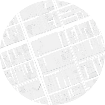
Melbourne

Sydney
This is something that I would love to do more research on because of how the urban planning experience of a city can impact how we live.

Other insights:
01
People ordered delivery for convenience when they did not have time to cook as a comfortable last minute alternative to cooking and when they wanted minimal human contact
02
Users relied mostly on UberEats exclusively for delivery
03
Users wanted food straight to their door, but understood that the delivery driver could not do this due to COVID restrictions
04
Users liked to multitask and thus wanted to be certain when food was arriving and were frustrated with the unclear updates and notifications they were getting about delays
05
All participants had COVID safety concerns but only female participants reported additional physical safety concerns
Time to pivot.
As a UX designer, we solve problems for the users and now the users had a different problem to the client.
The original problem was inaccuracy of GPS, but from the interviews, the new problem was around better updates and safety when accessing food delivery in Melbourne.
Meet Helena.
Helena is a young, busy, urban professional living in Melbourne.

Due to her busy work life, she wants food delivery that is convenient and efficient to eat ASAP.
Needs to know where her food is and how long it is going to take so she can effectively plan her time while waiting.
Needs accurate info about journey times with updates to delays without constantly checking the app.
Needs a contactless way to pick up food for her safety concerns
Click here to see journey map

After plotting out Helena's UberEats journey, it was clear that the primary problem was to do with the delay in her order with no clear notification, causing frustration.
A secondary dip was when she had to go down to pickup the food, worrying about safety.
Primary Problem.
The primary problem identified was no clear updates when not in the app which left users unable to use and plan time effectively while waiting.
“Helena needs a way to ensure she knows where her food is because she wants to multitask while waiting”
Secondary Problem
There was also a secondary problem that was identified around safety/human contact.
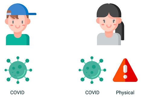
It was interesting that male participants reported only COVID safety concerns, but female participants reported additional physical safety concerns, something that I did not even think about before these interviews.
How does UberEats work?
After identifying the real problem, I researched more about how the UberEats app worked in relation to the problem faced by Helena.
I downloaded the UberEats app and placed and order, making sure to document every step of the process, from ordering and notifications to UI layout to their COVID policies to better inform my solution.

How to tackle this?
The problem was split into 3 angles

More accurate updates

More accurate tracking

Remove the need for tracking
I then ran ideation exercises with two other designers to come up with 3 solutions
Click here to see what we did
We split these into statements to give us direction with ideation:
How might we...
Deliver more accurate updates in order to help maximize the use of waiting time?
Make tracking more accurate to help maximize use of time?
Remove the need for tracking?

We voted on which idea we thought was the best through an MVP lens using miro.
3 Solutions.
The 3 features that were developed to combat the problem of uncertainty around delivery were:
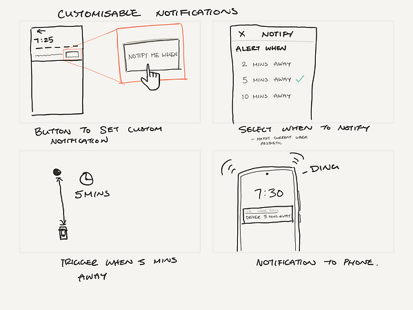
1. Better custom notifications
Better custom notifications to be alerted to status changes while users waited.
This would be focused on giving users better and more accurate updates as currently there was currently no way of knowing at a glance where your food or if any delays happened was without opening the app.
2. Overlay Google Maps traffic data
Overlay google maps traffic data to see when drivers are in traffic and where they are stuck.
This is to not only know where drivers are but also gives peace of mind. Interviews showed that people were more understanding if they knew about factors outside of the driver’s control eg COVID

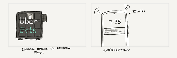
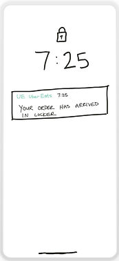
3. Temperature controlled, secure P.O. box style locker
A heated and secure PO box style locker that would send an arrival notification when food arrived.
his meant that users could come and get the food whenever they wanted and thus could multitask freely. It also had the additional benefit of solving our secondary pain point around contactless delivery that has become so important in our current world.
Driver drop-off

Customer pick-up
.png)
.png)
But would users understand?
I created a low-fi paper prototype to test if users would be able to understand the solution.
I asked 5 participants to talk us through what they saw to experience what they understood in the moment

We found there were a 3 major usability problems
Click here to see more

Users were clicking text instead of the tickbox
This was an oversight on my part, not checking how UberEats had also included the text as part of the clickable option

Users were unsure what the colors meant
Users did tentatively guess traffic but were not sure. This was due to the color block not being on the route.
Some users ignored the locker arrival notification
Some users were accustomed to going down straight away to collect their order once they received the notification. This led them to not action the notification and miss the prompt to identify the locker.
Hi-fi Prototype
Using the results from the usability testing I created hi-fi prototypes of the screens and locker in Figma and Rhino 3D.


Live traffic on route

Locker code screen
Better custom delivery
and arrival notifications

Confirmation screen

Open and closed visualisations of UberLocker
Learnings and takeaways.
This project was my first UX project so definitely a challenging one but also equally as rewarding. I have realised that I want to pursue the ability that digital design has to elevate physical design. I want to be at the intersection of these two aspects and explore how they can enhance each other.
-
Teamwork really makes the dream work
-
Before this project, I thought the crazy 8s exercise was a waste of time
-
However, after working with other designers to ideate, I have learnt how effective this exercise is, other designers able to cover different aspects and think in ways that I would never have
-
-
UX Design allows us to push back against the original problem
-
If there is another more pressing problem we can push back to meet the needs of the users
-
-
Sydney's CBD layout still does not make sense
Click for my deeper realisation
As a UX designer, we solve problems for the users and now the users had a different problem to the client.
This ability to pivot was something that was almost alien to me but I knew that my gut was right and I decided to focus on the new problem. It was then that I realised how much I was going to enjoy UX.
I get to focus on what people will want and use, rather than solely how to make the client more money. I could actually make decisions and push back to solve problems in a way that would actually solve issues, rather than dancing over the problem.

Check back here soon for more progress.
I am currently testing and reiterating on UberLocker to create a better product.
-
Usability testing of our hi-fi prototype
-
More research in different states to see if urban planning has an effect on delivery
-
Testing prototype of physical UberLocker through low cost means eg. shoeboxes to test concept
-
Pitch to Uber and become a millionaire...